Queen logo: Who designed it and what does it mean?
30 November 2018, 16:39

It's one of the most recognisable band logos of all time, but where did it come from?
Queen have used the logo ever since their very first album, and it has become as synonymous with the band as Freddie Mercury's yellow jacket and Brian May's hair.
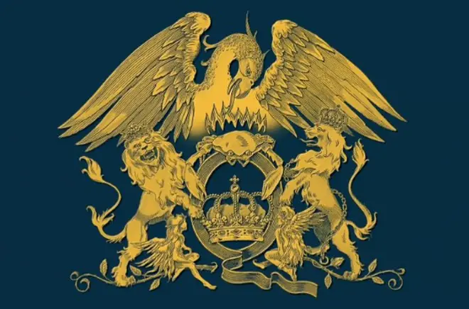
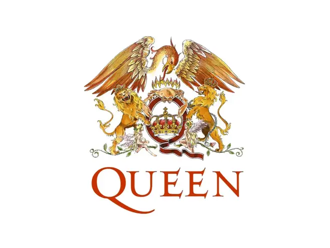
Having attended art college, Freddie Mercury actually designed Queen's logo, called the 'Queen crest', shortly before the release of the band's first album in 1973.
The logo combines the zodiac signs of all four members: two lions for Leo (John Deacon and Roger Taylor), a crab for Cancer (Brian May), and two fairies for Virgo (Freddie Mercury).
The lions can be seen embracing a letter Q, while the crab rests on top the letter with flames rising directly above it. The fairies are situated below a lion.

There is also a crown inside the Q, and the whole logo is contained by a huge phoenix. The symbol resembles the Royal coat of arms of the United Kingdom, particularly with the lions.
The original logo can be seen on the reverse-side of the cover of the band's first album, was a simple line drawing. Later sleeves featured a more detailed coloured version of the logo.


